 Tweet
Tweet
If a guy has been elected to the National Baseball Hall of Fame, then you know he was special. However not all hall of famers are created equally. Guys like Babe Ruth, Willie Mays, and Hank Aaron are some of the greatest names to ever play the game and are in a league of their own. While guys like Catfish Hunter, Tony Perez, and Gaylord Perry were good enough to get enshrined, but let's face it... they just aren't in the same breathe as the legends.
Today... I'm continuing the countdown of my favorite Topps baseball base card designs and today's group is focusing on the second tier of sets.
What does that mean?
It means we'll be looking at four sets that I deem to be amazing looking. However... they aren't quite first ballot hall of famers. Before I get into my list, if you want to check out the Tier Threesets (sets #16 to #11) and/or would like to read my scoring criteria... click here.
Okay... let the rankings begin.
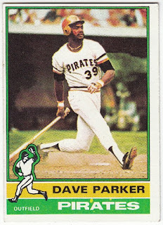
#10: 1976 Topps
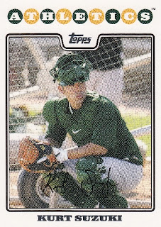
2008 was the year I dove head first back into the hobby and discovered Topps used the same design for its baseball, football, and basketball card products. For some reason, I though this was the coolest thing and this design will always be a reminder of that fact.
But that's not why it's in my Top 10 list. See those colored balls with the team name inside of it? That single feature makes this set amazing.
#8: 2004 Topps
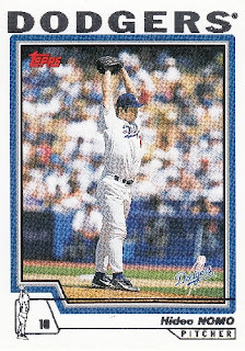
The 2004design borrows the player icon from the 1976set... but upgraded it. This time Topps substituted the generic fielding icons with ones that actually match the player's photo. The team colored borders and franchise logo are nice finishing touches to my 8th favorite design.
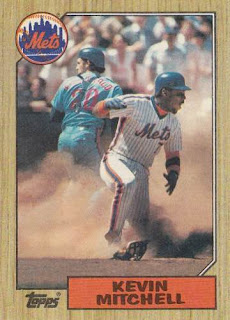
#7: 1987 Topps
More...
Today... I'm continuing the countdown of my favorite Topps baseball base card designs and today's group is focusing on the second tier of sets.
What does that mean?
It means we'll be looking at four sets that I deem to be amazing looking. However... they aren't quite first ballot hall of famers. Before I get into my list, if you want to check out the Tier Threesets (sets #16 to #11) and/or would like to read my scoring criteria... click here.
Okay... let the rankings begin.
#10: 1976 Topps

The combination of bright colors and the fielding icons make this design a winner in my book. I really, really enjoy this design. Back in October, I had this set listed at #7. But today... I'm just feeling the newer designs a little more.
#9: 2008 Topps
#9: 2008 Topps

2008 was the year I dove head first back into the hobby and discovered Topps used the same design for its baseball, football, and basketball card products. For some reason, I though this was the coolest thing and this design will always be a reminder of that fact.
But that's not why it's in my Top 10 list. See those colored balls with the team name inside of it? That single feature makes this set amazing.
#8: 2004 Topps

The 2004design borrows the player icon from the 1976set... but upgraded it. This time Topps substituted the generic fielding icons with ones that actually match the player's photo. The team colored borders and franchise logo are nice finishing touches to my 8th favorite design.
#7: 1987 Topps

If you asked me about this set ten years ago, I would have told you it was average at best. Heck... back in 2013, I ranked it as one of the decade's worst in terms of Toppsdesigns.
Talk about a comeback. A lot of my disdain for this design had to do with the sheer number of packs I busted of this product and the fact that it reminds me of the Junk Wax Era. However... these days I appreciate the way Topps combined wood grain borders, team colored themes, and team logos to make a great looking design.
Well... there you have it. Stay tuned for the final countdown. I've made it pretty clear that there's plenty of moving around within the Tier Three and Tier Twogroups. However... my Top Six sets are set in stone. I'll reveal my picks sometime next week.
In the meantime, feel free to discuss your favorite Topps baseball base card designs... as well as comment on my selections.
Happy Monday and sayonara!
More...