After months of deliberation... I'm finally going wrap up my favorite Topps baseball base card design rankings. It started out with me trying to rank everything from 1952 to 2015... but the task was way too overwhelming. Either that or I'm just too lazy. So I attempted to narrow things down to just the best of the best and ended up with sixteen designs.
That led me to a huge game of musical chairs where my rankings varied day to day depending on my mood. I solved that problem by throwing my favorite designs into tiers and today... I reveal the crème de la crème: The Sensation Six.
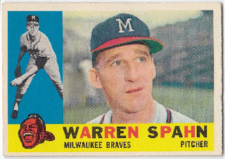
#6: 1960 Topps
This card has a little bit of everything in terms of what I enjoy seeing on trading cards: dual images, team logos, and bright colors.
In a sense... this card is in a league of its own. On one hand... it doesn't really belong in the same tier as my five favorite designs. In fact, there's a pretty wide gap between this set and the #5 set. On the other hand... I felt like I wasn't giving it enough credit by inserting it into the Tier Twogroup.
#5: 1975 Topps
I have loved this card design since I was a little kid. Obviously the bright colors are the main attraction, but I also love the tiny baseball that houses the player's position. This set really deserves to be higher on the list, because I love it so much... but unfortunately... I just couldn't bump anything out of the Top 4.
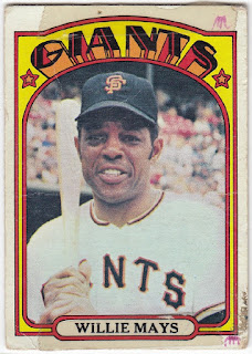
#4: 1972 Topps
This set will always be special to me, because it's my birth year set. Unfortunately... this list isn't about sentimentality. It's about the design... which happens to be awesome anyways.
While some look at this set and think of "tombstones", I immediately think of movie theaters from my childhood. The font and design resembles the displays I'd see hanging outside of movie theaters and really pop off of the card. Plus it features those same amazing colors found on the 1975 and 1976designs.
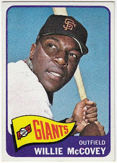
#3: 1965 Topps
Are you ready for me to sound like a broken record? I love the bright colors and the team logos... but let's be honest. It's the pennant that makes this card design stand out. They're a symbol of baseball and ever since I was a little kid, I've had at least one baseball pennant hanging on a wall somewhere in my place.
#2: 1983 Topps
Up until a few years ago, this card was my favorite card design of all-time. It's literally perfect. There's nothing I would change to this design. Okay... so it's lacking team logos... but honestly I have no idea where they'd put it without jeopardizing the beauty of this design. And the only reason it's no longer #1... is that perfection trumps perfection.
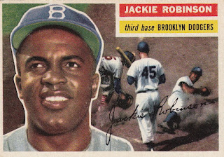
#1: 1956 Topps
When I think of the perfect baseball card design... this is what I envision. Portrait? Check. Action shot? Check. Artwork? Check. This design deserves to be featured in its own museum, because every single card is a work of art. My words don't do this design justice. Just stare at the card and see for yourself.
Okay... it's your turn and the moment I've been waiting for.
What are your favorite Topps baseball card base card designs?
Happy Tuesday and sayonara!
More...


