 Tweet
Tweet
Some might say I missed a golden opportunity yesterday morning by not taking in*the packout and quality-control processes for 2010-11 Gold Standard Basketball. I would normally tend to agree with that assessment, but there’s*something to be said for the mandatory 80-minute marketing meeting I attended instead.
Besides, when you’ve got fellow card-loving comrades (and Panini America*product development professionals) Mike Payne, Aik*Tongtharadol and Keith Hower on the scene to capture images of the*resulting*treasures exclusively for The Knight’s Lance readers, well, you know you’re in good shape.
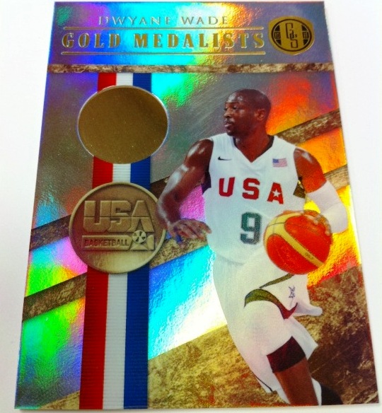
It’s no secret that I’ve been*sold on the solid-gold stylings of 2010-11 Gold Standard Basketball from the moment I found out we were doing it.*After seeing the first live cards from the product, I’m even more in love with the product.**
From the uniqueness of the packaging to the painstakingly true-to-theme nature of the insert nomenclature and designs, I find the set to be absolutely fantastic –*and I would say that even if I wasn’t getting paid to. After mining*the following 48 good-as-gold sneak peeks, I’m confident you’ll feel the exact same way.


More...
Comment